ADA Compliance Checkmark
If you own or manage a business, school, office building, or commercial property, you've probably seen signs with raised lettering, Braille, and the familiar accessibility symbol. These are more than just design details. They help people with disabilities navigate a building, identify rooms, and access facilities independently.
But what makes a sign ADA-compliant? Do all signs need Braille? Does the color or size of the lettering matter?
At Davis Sign Co., we help businesses and organizations understand their signage options, including ADA Braille signs and room identification signs. Here's a straightforward guide to the basics of accessible signage and what to consider when planning signs for your property.
What Are ADA Signs?
ADA signs are signs designed to meet applicable accessibility requirements under the Americans with Disabilities Act (ADA). They help people with disabilities, including people who are blind or have low vision, navigate buildings and identify important spaces.
The requirements depend on the type and purpose of the sign. For example, a permanent sign identifying a restroom generally has different requirements from a temporary promotional banner or a sign directing visitors toward an exit.
According to the U.S. Department of Justice's 2010 ADA Standards for Accessible Design, certain permanent room identification signs must include raised characters and Braille, while other informational signs must meet specific visual readability requirements.
The goal is simple: make important information accessible to as many people as possible.

Room Identification Signs
Room identification signs tell visitors where they are or what a room is used for.
Common examples include:
Office and conference room signs
Classroom and school room numbers
Examination rooms and other healthcare spaces
Employee-only rooms
Building and floor identification signs
Permanent room and facility labels
For many permanent interior room identification signs, ADA standards require raised lettering and Braille so people can read the sign visually or by touch.
What makes a room sign accessible?
Raised lettering: The letters should be raised above the sign's surface so they can be felt with the fingertips.
Braille: Compliant signs generally use contracted Grade 2 Braille, which represents words and letter combinations using standardized patterns of raised dots.
Appropriate lettering: Required tactile characters must use a simple, sans-serif typeface. Decorative scripts, italics, and unusually stylized lettering are not suitable for tactile text.
Correct placement: Signs with tactile characters generally need to be installed on the latch side of the door, at a height and location that meet accessibility requirements.
These details matter even when a sign looks attractive and easy to read. A sign can have beautiful graphics and still fail to meet the requirements for its intended use.
Restroom and Bathroom Signs
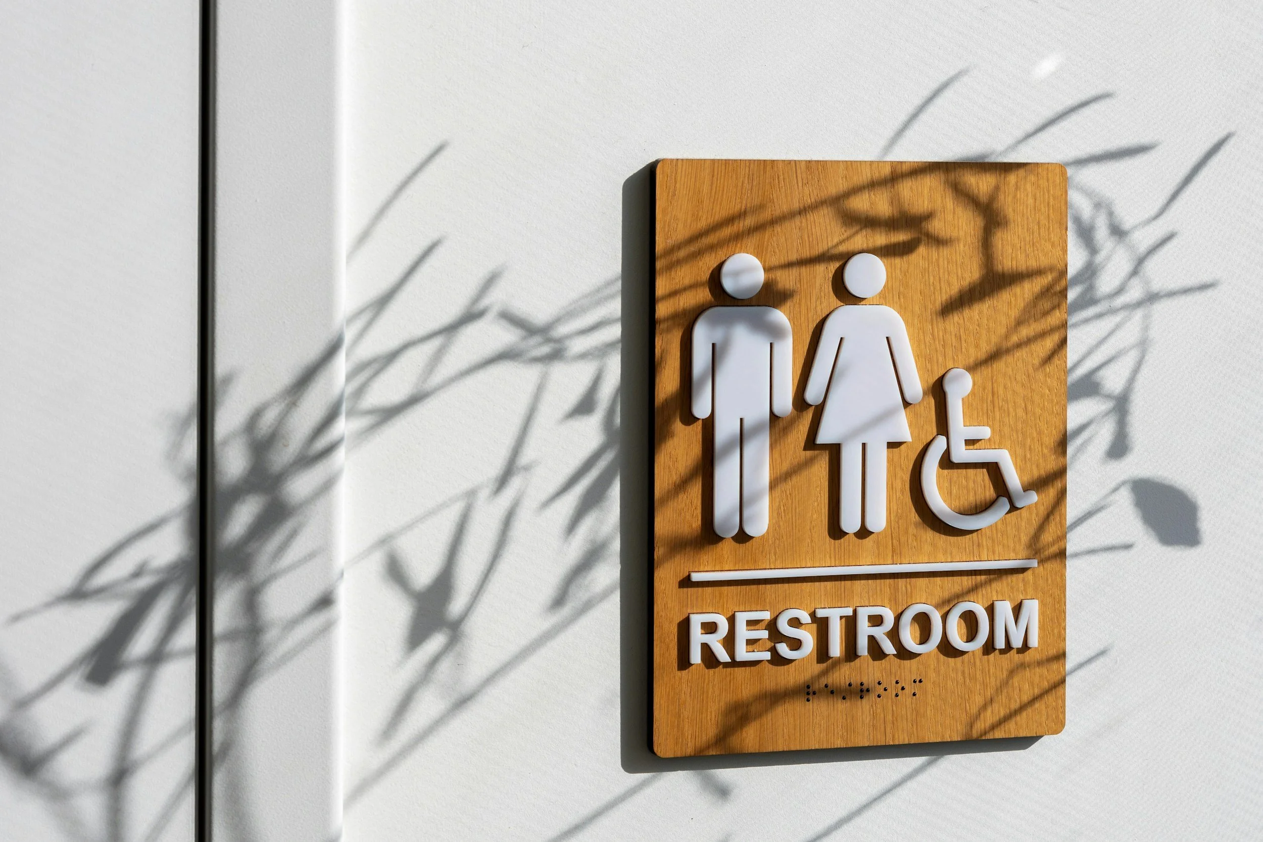
Restroom signs are among the most familiar examples of ADA signage. They help visitors locate facilities and identify the appropriate room.
Depending on the facility and the sign's purpose, restroom signage may include text, pictograms, raised characters, Braille, and accessibility symbols.
A pictogram is a simple graphic used to communicate information, such as a figure representing a restroom. When pictograms are used to identify permanent interior rooms and spaces under the applicable ADA requirements, they need to be accompanied by tactile text descriptors.
What should you consider when ordering restroom signs?
Clear identification: Use recognizable wording and symbols so visitors can identify the facility.
Accessible lettering: Where required, include raised characters and correctly formatted Braille.
Color contrast: Choose lettering and backgrounds that are easy to distinguish.
Non-glare finishes: Avoid surfaces that reflect so much light that the information becomes difficult to see.
Correct installation: Make sure the sign's location and mounting height meet the applicable standards.
You can still incorporate your organization's colors, logo, or visual identity where appropriate. The key is to ensure that decorative elements do not interfere with the required accessible information.
Accessible Parking Signs
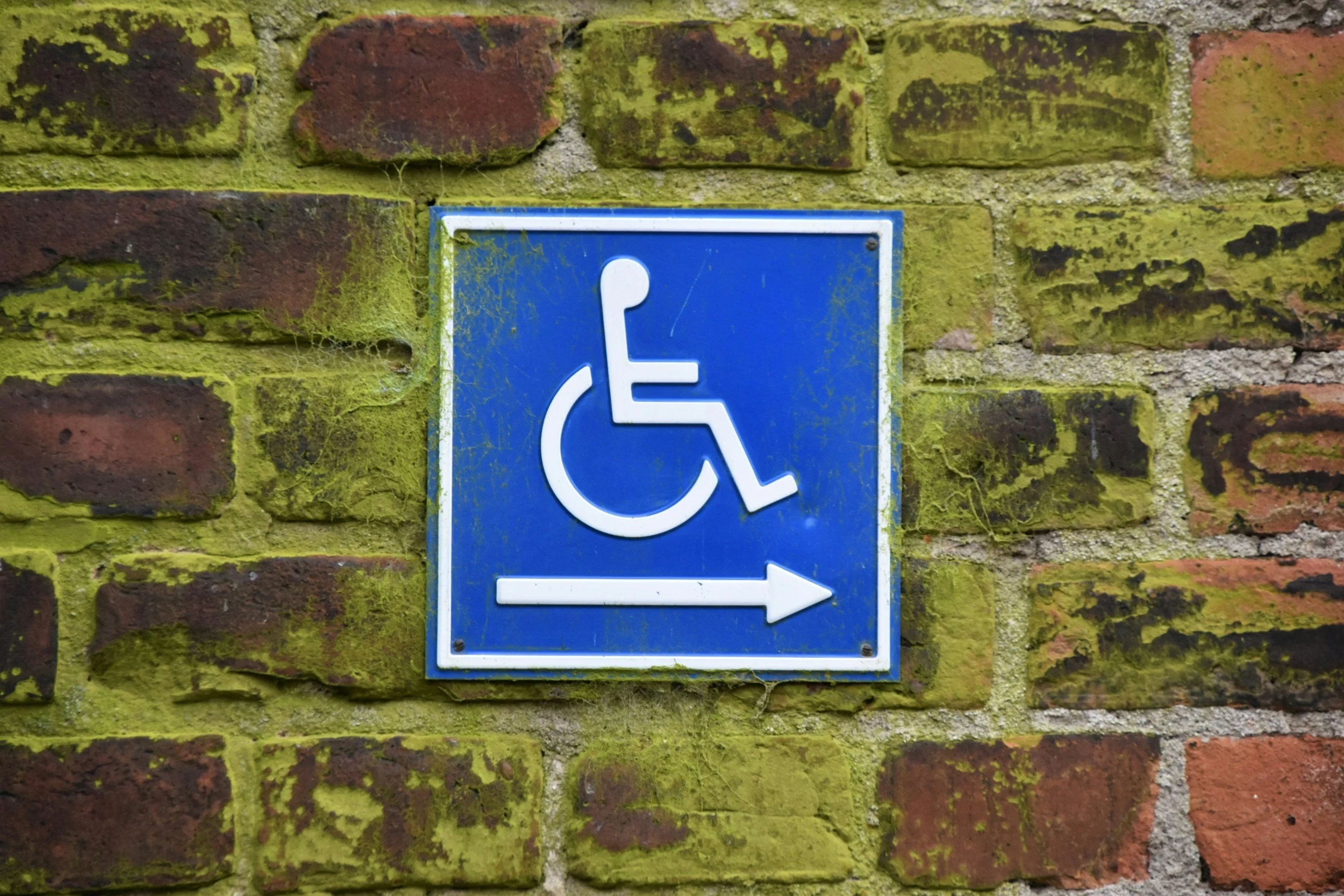
Parking signage has its own accessibility considerations. Accessible parking spaces must be identified with the appropriate signage where required, helping drivers locate designated spaces and understand which spaces are reserved for accessible parking.
Depending on the facility and applicable requirements, parking signage may identify:
Accessible parking spaces
Van-accessible parking spaces
Parking restrictions and enforcement
Routes toward accessible entrances
Accessible entrances and other destinations
The International Symbol of Accessibility—the familiar wheelchair symbol—is commonly used to identify accessible parking.
What should property owners know?
The number of accessible spaces required depends on factors such as the total number of parking spaces and the type of facility. Van-accessible spaces also have specific requirements.
Under the 2010 ADA Standards, accessible parking identification is addressed separately from many interior room signs. Standard accessible parking signs do not automatically require the same raised lettering and Braille used for permanent room identification signs.
In California, state accessibility requirements may also apply. Property owners should verify the applicable federal, state, and local requirements before ordering and installing parking signs.
For shopping centers, offices, schools, apartment complexes, and other properties, correct parking signage is an important part of making the site easier to navigate.
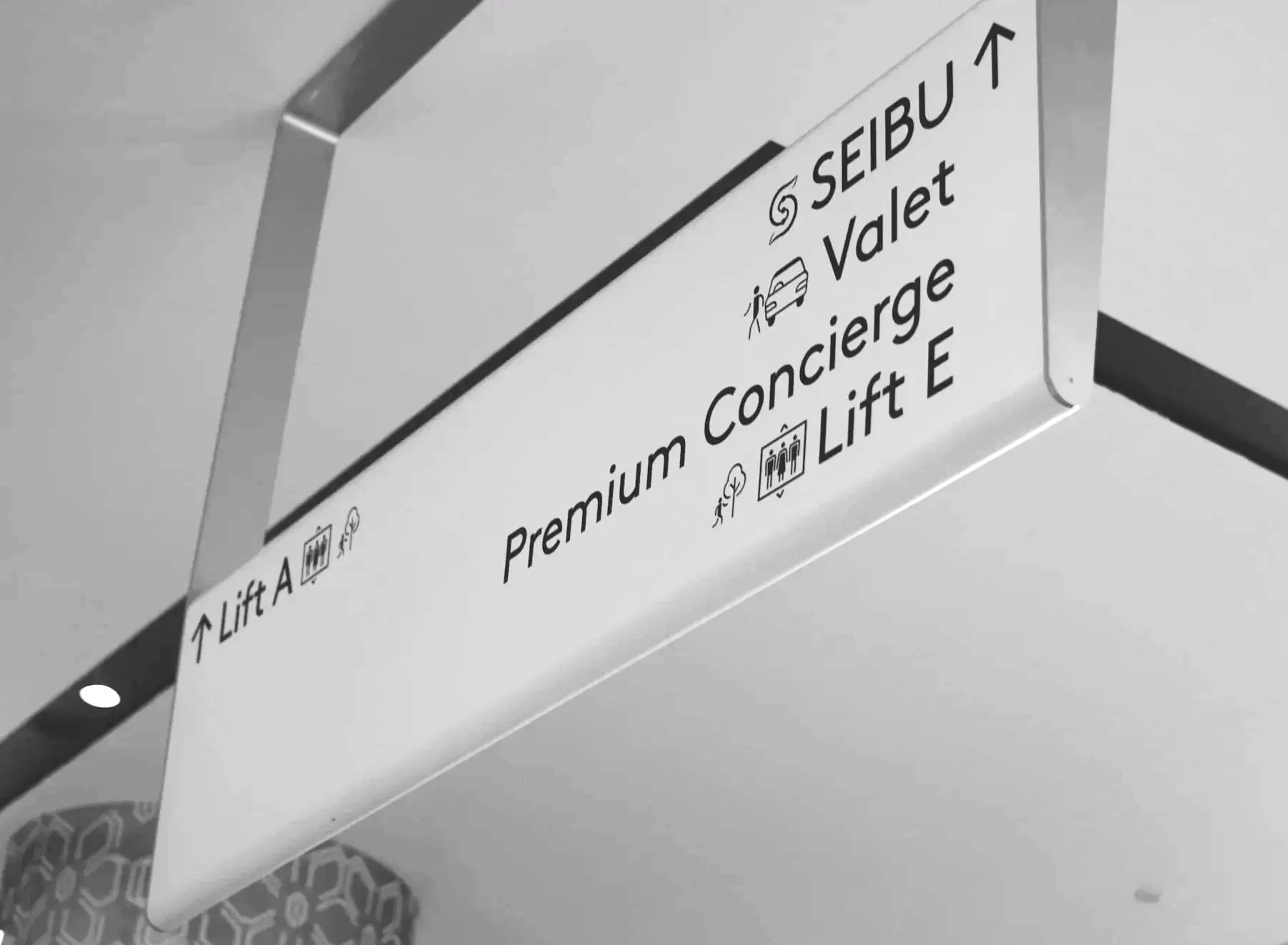
ADA Sign Design: Size, Fonts & Color Contrast
Accessible signage involves more than adding a wheelchair symbol or Braille dots. Lettering, contrast, finish, and placement all affect whether people can use the sign.
Here are some important design considerations.
Sign and lettering size
There is no single size that works for every ADA sign. The required dimensions depend on the sign's purpose, the characters used, and other installation details.
For required raised tactile characters under the 2010 ADA Standards, character height is generally between 5/8 inch and 2 inches, measured using the uppercase letter "I." A limited exception permits smaller raised characters in certain signs where separate visual and tactile text is provided.
Visual lettering has its own sizing rules, which vary according to viewing distance and mounting height.
The important takeaway: don't assume that making the sign larger automatically makes it compliant. The character dimensions and the sign's intended use must both be considered.
Fonts and lettering styles
For tactile lettering, simple sans-serif fonts are required. These fonts have clean letterforms without the small decorative strokes found on serif typefaces.
Avoid using script fonts, italics, or highly decorative lettering for required tactile characters.
Visual-only information can have different requirements, but it should still be easy to read. A straightforward typeface is often a practical choice for directories, directional signs, and other informational displays.
Color contrast
Color contrast refers to how clearly the lettering stands out from the background.
For example, dark lettering on a light background or light lettering on a dark background can help people distinguish the message. The ADA Standards require appropriate contrast for covered visual characters and specify a non-glare finish.
There is no universal rule that every ADA sign must use a particular color combination. The priority is legibility, compliance, and the needs of the specific application.
Finish and glare
A glossy sign can reflect overhead lighting, sunlight, or nearby windows, making the lettering harder to see.
A non-glare finish helps reduce this problem. The choice of surface and material should support readability while also meeting the property's durability and design needs.

Can ADA Signs Still Match Your Brand?
Yes. Accessible signage does not have to look generic or out of place.
Specialist sign makers, including H. Toji & Company at 4ADAsigns, demonstrate how accessible signage can combine tactile lettering, Braille, strong visual readability, and thoughtful architectural design.
A well-planned sign system can complement a building's interior while making information accessible. For example, visual text can be incorporated into a larger decorative sign, with a tactile and Braille companion sign positioned appropriately nearby where the applicable standards permit that approach.
Material choices, colors, shapes, and graphic elements can all contribute to the appearance of a sign. However, the required tactile information, lettering dimensions, contrast, and placement must still be addressed.
The best approach is to plan accessibility requirements alongside the visual design, rather than trying to add them after the signs have already been produced.

Common ADA Signage Mistakes to Avoid
California properties may also be subject to state accessibility provisions, including requirements under California Building Code Title 24. A sign supplier can help with sign specifications, but a qualified design or code professional should confirm compliance for the full project when necessary.
When planning signage for a new building or renovating an existing property, watch out for these common issues:
Using printed Braille-like dots instead of compliant Braille. Braille has precise spacing and dimensional requirements.
Choosing decorative fonts for tactile text. Required raised characters must follow the applicable typeface rules.
Ignoring sign placement. Even a correctly manufactured sign may be installed incorrectly.
Assuming every sign has the same requirements. Permanent room identification, directional signage, and parking signs have different rules.
Choosing poor contrast or highly reflective finishes. These can make visual information difficult to read.
Treating a stock sign as automatically compliant. The sign must be appropriate for its intended application and installed correctly.
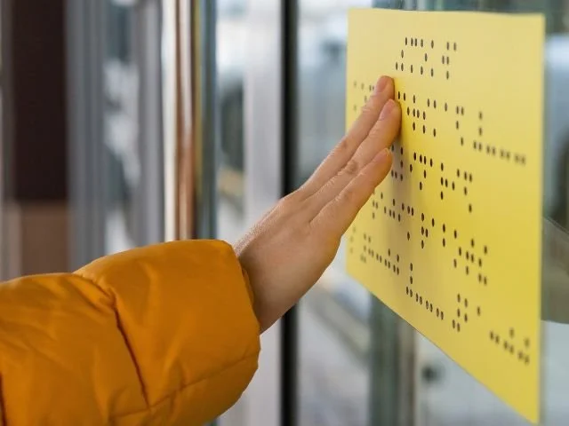
Need ADA Braille or Room Identification Signs?
Davis Sign Co. provides signage solutions for businesses, schools, organizations, and commercial properties throughout Marin County and the surrounding Bay Area.
Whether you're updating office room numbers, identifying restrooms, improving navigation through a building, or planning signage for a new facility, selecting the right signs early can help you avoid unnecessary revisions later.
Explore our ADA Braille & Room ID Signs page to learn more about our signage options.
Wish to add ADA signage to your property or store? We can help!
Contact Davis Sign Co. to discuss your project, explore available sign styles and materials, and determine the appropriate next steps for your signage needs. For projects with specific accessibility requirements, confirm the applicable standards and installation specifications before production.